[et_pb_section admin_label=”section”]
[et_pb_row admin_label=”row”]
[et_pb_column type=”4_4″]
[et_pb_text admin_label=”Text”]
So I’ve spent the last couple of weeks beavering away on a website redesign to try to find a new blog theme (still using wordpress). (edit: I just noticed the last time I started playing around with my website theme was almost exactly two years ago. I guess I get bored during the winter months or something). This was kicked off when I tried to add a banner for the website and couldn’t figure out how to do it without breaking the whole theme. I also figured I wanted to slightly move stuff around and then that proved to be hard, so my choices were either
- learn CSS and not only create a custom website but learn an enriching new skill which would open up lots of job opportunities
or
- be lazy and buy a theme
Of course I went for the latter. I was torn between Themeforest and Elegant Themes but eventually went for Elegant Themes as they had a big ol’ new years sale with 50% off. The main difference between the two is that Themeforest sells individual themes at around 40 bucks a pop while Elegant Themes has a subscription service that gives you access to all their themes.
I am using the Extra theme and kind of have mixed feelings about how it turned out. It still required learning some CSS but the main website layout is a lot easier to edit now, and I feel I have a lot more control over the blog theme.
I looked at some successful travel blogs (like www.neverendingfootsteps.com) and they all seemed to have a similar layout – a nice banner, followed by a small front page blerb. I copied that for my website, but I have mixed feelings about how it turned out – I almost feel the actual blog posts are kinda pushed down too far. Please give feedback! No seriously, let me know if it kind of sucks.
The blerb itself is kinda embarrassing – it almost feels way too ‘HEY GUYS LOOK AT ME COME FOLLOW ALONG’ *rolleyes*. We’ll see if I warm up to it. Every blog is really an exercise in ego but still…
While still on the blerb, you’ll notice I’ve put that I am sailing around the world in black and white, right there on the front. Yup. No going back now. I have 120(!) days left, have already made my money target, and am going to give 3 months notice at the end of February. aaaaa!
What else? I created a new youtube channel (which is empty) for any videos I may or may not make (they get a lot of watches but video editing/shooting is a huuuuuge pain) and I also setup a twitter account, which is a way to drop sick one liners another way to subscribe to new posts. Click the FANCY BUTTON on the right or at the top to subscribe if you know how to use twitter (disclaimer: I actually have no idea but it’s setup automatically).
Oh, and comments can now use a wordpress/facebook/twitter account etc.
It’s been raining pretty much CONSTANTLY which has exposed my old nemesis again – the leak-above-the-nav-table. It’s way less than it has been though, and I think I know where it is coming from. Unfortunately, it’s too late to fix it until the weather changes (and drys up). Added to the list!
In addition we have been battered by storms recently as well, here is the latest one
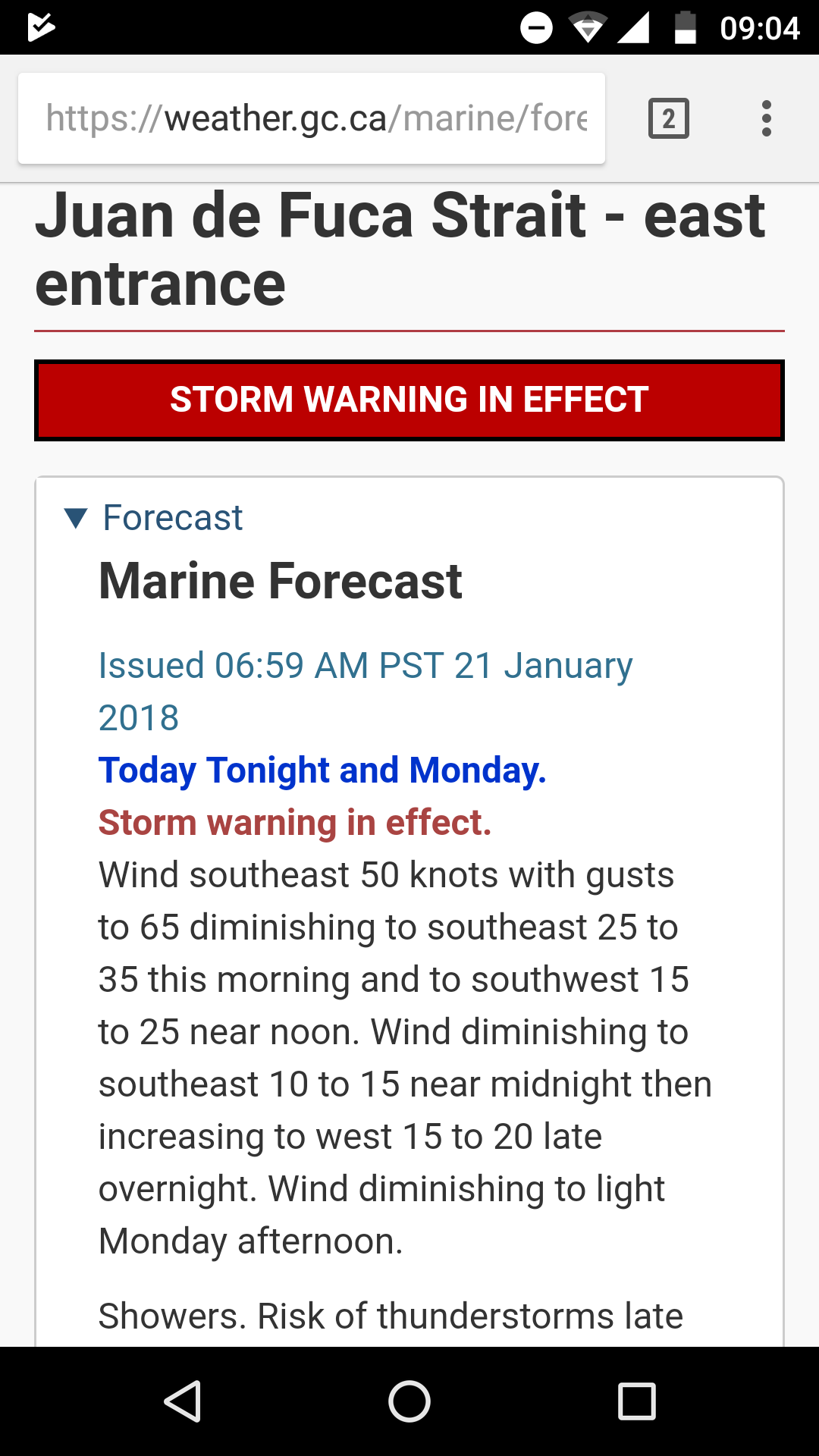
Yup, 50 knots gusting 65 (which is cat 1 hurricane status).
Luckily my new marina is waaaay more sheltered than the old one at fishermans wharf, I am seeing probably 15 knots less wind than I used to get there, so it really isn’t that bad.
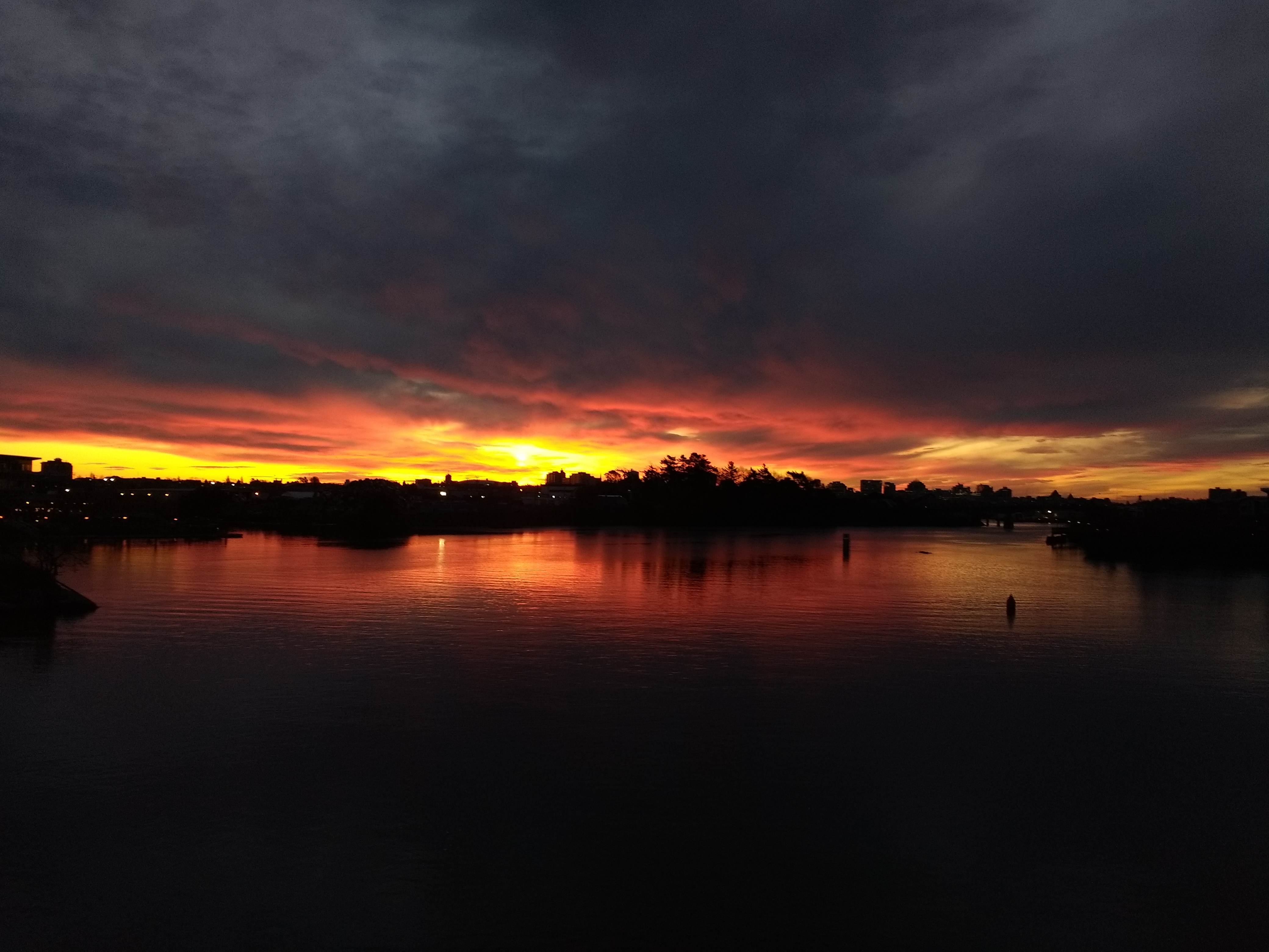
And finally, here is a nice sunrise I took on the way to work, so I can use it as the thumbnail pic of this article #lifehacks
[/et_pb_text]
[/et_pb_column]
[/et_pb_row]
[/et_pb_section]
Looking good! A few notes about the design…
• The instagram link doesn’t work. In fact it isn’t linked to the account I follow at all? ( https://www.instagram.com/mparsons1982/ vs https://www.instagram.com/lifeongudgeon/) (NOTE: I see this only applies to the links at the top of the page; but since I couldn’t get back to the home page I didn’t see the others 🙂 (see point 3)
• I personally think that without a sidebar the blog pages are too wide. It is harder to read a long line length like that, especially on a big screen.
• You’ve taken the home button off the menu and clicking on the banner doesn’t take you back. You should be able to do one or the other.
• Now that I’ve figured out the social media links, be sure to add youtube and Google+ icons to the the top and bottom links
And just note that people like me who follow along on RSS or rely on social media links will mostly go straight o the posts and never see the opening page…
120 days! So excited!
Bruce
That’s great feedback, thanks for taking the time to comment Bruce!
I like it, especially on mobile! +1 that on desktop the width is a bit wide for easy column-based reading. Also not a big fan of the Previous / Next overlay buttons because they float over the comment input box while I’m trying to enter text.
I think the homepage is good. It all depends on where you want to go with the blog, but saying you’re sailing around the world (even if you don’t actually end up doing so) is great for gaining followers, which is important if you eventually want to go the Patreon or affiliate advertising route. (lately I’ve been thinking about ways to make our blog at least pay for itself so I’m not losing money on it).
Thanks Patrick, I’ll see what I can do about those previous/next buttons. Maybe put them at the bottom or something.
Yeah the eventual idea is to have the blog pay for itself…